When a brand refreshes, we usually look at changes to logos, fonts, and the general aesthetics and compare the new look to the old one. WP Engine have done a good job at that, but the main story here is the introduction of a new ‘Confidence Online’ idea. I’ll talk about this first.
An important point: this is not a repositioning. Instead, they are weaving in a new theme that reinforces the foundations of their existing brand pillars. Here’s why I think that the ‘confidence’ concept is brilliant:
- It reflects the product experience, which has been refined over the years
- It’s an expression of a brand and company that has been extraordinarily successful
- They want their customers and partners to be just as confident as they are
I also think that it serves as a counter-argument to the idea that WordPress is not secure. This is a perception that needs to shift, particularly in the Enterprise space.
Here’s how these ideas are expressed on their website to support the confidence online tagline:
Our customers, site owners, digital strategists, developers of small- to mid-sized businesses and enterprises, and agencies deserve the confidence that their work will thrive. This confidence is delivered through WP Engine’s elevated WordPress expertise, people-focused culture, relentless innovation, and unmatched performance.
It’s a new idea, too. We’ve all heard about high-performance, best speeds, 24/7 security, democratizing this and that, etc., all too many times. These are ideas that have become meaningless, so good to introduce something different.
Here’s what a confident brand looks like
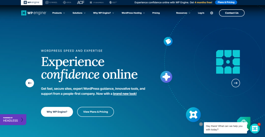
Let’s start with their homepage, where the new theme is promoted as one of four slides of the hero section. So not the star of the show but one of the leading actors. I suspect there would have been a fair bit of negotiation internally to determine which slide would load first (and therefore is most important).

Good to see all refreshed elements in one spot: the new logo, icons and fonts.
Confidence Online is the hero on social media, though. For the moment, at least. On the cover images of their social channels as well as advertising efforts.
Here’s a great execution on X/Twitter:
Build your WordPress sites with confidence. pic.twitter.com/SdL1vMypc2
— WP Engine (@wpengine) May 28, 2024
I suspect that the budget for this campaign will be generous enough to reach a broad audience enough times to hammer in the message and ensure that, going forward, prospective cusromers associate WP Engine with all the positive connotations associated to ‘confidence’.
Bringing order to WP Engine’s brand architecture
The scope of the exercise is articulated earlier on in their announcement:
…However, this growth also created a mosaic of different brand identities that didn’t fully convey the unified excellence we aim to achieve. This challenge sparked a transformative journey at WP Engine, starting today with a comprehensive digital brand refresh that unifies and elevates our company brand.
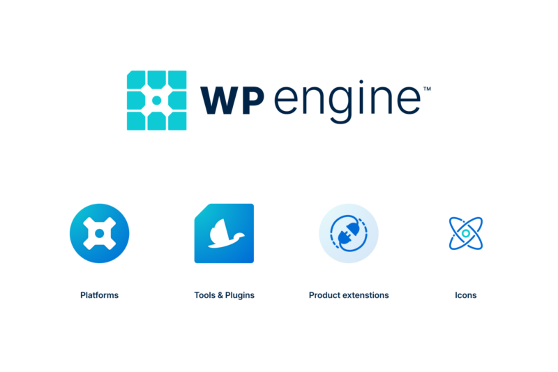
A mosaic of over 20 pieces, including their hosting products, plugins, tools and community events, that are now closer aligned via a shared visual language. It’s not quite the same approach as taken by Google with it’s portfolio, for example, where products happily exist individually while sharing the same visual style and color palette. WP Engine’s brand architecture features a number of layers that are needed to bring order, starting with categorization: Platforms, Tools & Plugins, Product extensions and Icons.

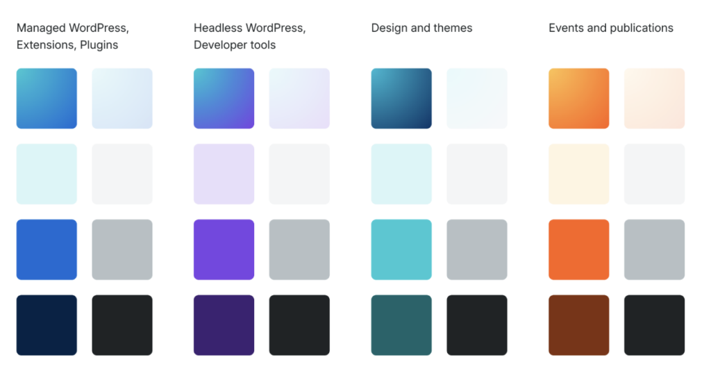
Looking at this list I feel there’s one item missing: Content and Community. WP Engine publishes a number of publications and run numerous events. I would argue that they are a media company as much as a product one. This aspect is worthy of representation. Interestingly, their color palette includes an Events and publications set.

This palette is particularly interesting because it shows us how WP Engine’s branding team approached and resolved differentiation across their brand categories.
WP Engine’s logo finally makes sense!
No, I didn’t have an aha moment the instant I saw the new version. I just… finally read about it:
One crucial element as we embarked on this journey was honoring WP Engine’s history and the story behind the iconic WP Engine cog.
Since 2013, the cog has symbolized the coming together of all the pieces that make us “us,” from our Core Values to our place in the broader WordPress community. WP Engine now has a portfolio of products and we wanted to take this concept of parts coming together to a new level.
Rather than starting from scratch, we chose to reinforce the spirit of the cog in a modern context—with a clean, rounded design and new typeface—all aimed at making our mark even more iconic.
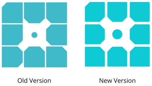
I hadn’t recognized the cog in the previous version and hardly do in the new one. But that’s because I’ve looked at a gazillion of cog icons throughout my career and have a very distinct idea about their shape in my mind. At least the new version has gained the symmetry and simplicity that stops me from wondering what the various cut corners meant.

I like how the logomark’s subtle evolution ends up with a shape that pretty much represents the new brand architecture, with hosting at its core:
We strategically utilized the shapes inside our new logo. The circular shape at the heart of our logo showcases our core offerings, namely Managed WordPress. The outer ring of square shapes describes the tools and plugins that we use to enhance WordPress for all members of the WordPress community—regardless of where their site is hosted.
The reference to WordPress users, whether WP Engine customers or not, may not be obvious but it’s part of the story too.
Fonts: introducing Inter for body text and Lora for headings
I like Lora. It’s usually harder to make a serif work for tech brands, but this one strikes a good balance between looking modern and corporate enough, and confident, of course.
Inter works well it but I’m less keen on it as I’m seeing it more and more as I browse tech websites. Is it going to be as predictable as Roboto is now in a couple of years?
Together, they do a great job giving WP Engine a fresher and even more mature look.
What can we learn from WP Engine’s brand refresh?
Firstly, that it’s a lot of work (and we should appreciate the Marketing team sharing the backstory). No doubt they looked at both quantitive and qualitative data to help them discover the most meaningful aspects of their brand, and then worked with Product to make sense of it all.
This was an evolution rather than a revolution. Less bold than Kinsta’s recent efforts, but just as meaningful. Enterprise wasn’t mentioned once in the announcement but it’s a very important segment, influencing a lot of the decisions.
It’s important to remember that WP Engine is further on in their journey than most WordPress product companies are and are tackling brand challenges that most don’t have. But it’s something any ambitious WordPress entrepreneur should keep in mind as new products are launched andor acquired. Brands develop over time, even organically. By this I mean how they are perceived in the market, which is critical to their success. Needing a brand re-fresh is a good problem to have. It means you can afford it. But it’s also symptom of a number of issues that would have cost you along the way.


